Coordinating Colors and Patterns by Using a Color Wheel
It can be challenging to know where to start when selecting the colors for new fabrics. To make it easier on yourself, you can use a color wheel, which is a fantastic resource to use while trying to decide what colors match and how well patterns complement each other. Do not be afraid to try different colors! Lots gorgeous homes integrate multiple color hues and patterns to create stunning rooms without appearing disorderly and disorganized. They achieve this appearance by ensuring their colors choice stayed consistent with the color wheel. With Sunbrella fabrics, Cushion Source can demonstrate how to coordinate colors for your home.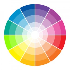
Basic Color Wheel
Your PRIMARY COLORS consist of Blue, Yellow and Red. When you combine your primary hues, you create the SECONDARY colors, which are Green, Orange and Purple. Lastly, mixing the primary colors with the secondary colors will create the TERTIARY colors.
Browse Our Many Fabric Colors and Designs
Coordinating Colors
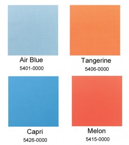 Start by selecting a color you love. Once you have it chosen, it will be easier to view the color combinations and decide on your coordinating colors. For instance, consider the color blue. On the color wheel, orange is directly opposite to blue, thus making these hues COMPLEMENT each other. As long as you stay within the realm of these two colors, you can experiment with various shades until you achieve the look you desire. You may also stay in the same color family, which is called this is called MONOCHRAMATIC, to create the look you want.
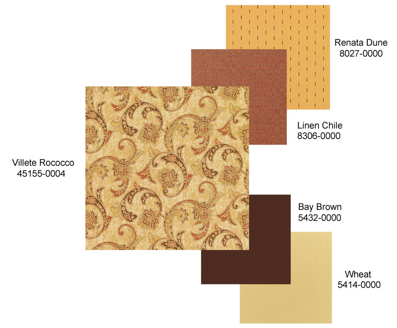
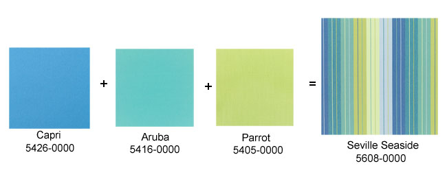
To create a multicolored pattern, you may use colors that are placed adjacent to one another on the color wheel, entitled ANALOGUES. These shades share solid undertones, which create an agreeable appearance.
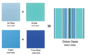
Split Complement
Split Complement colors are one step from the complement’s analogous colors. Its power is in the low-contrast appearance of analogous colors with the addition an opposite color.
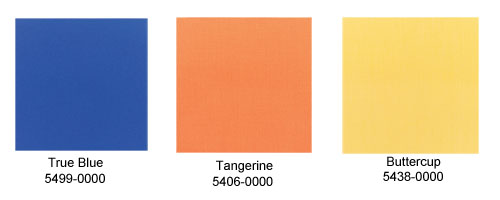
Consider the shade True Blue in combination with either of the two shades, Tangerine and Buttercup, placed beside its opposite color, Melon. These are split complement colors.
Combining Colors
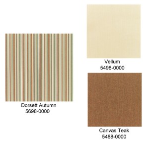
To complement this pattern Vellum or Canvas Teak Dorset Autumn. The best thing about neutrals is the multitude of pattern and color combinations available.
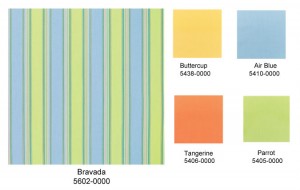
As another example, look at the various color combinations available to use with Bravada Limelite. If you want a low-contrast look, try Air Blue use Parrot for a higher contrast. You may also use Tangerine or Buttercup for a bright pop of color, since these hues are not as recognizable within the main fabric.
Patterns on Patterns
When combining patterns, it is best to select a large pattern with subtle shades and a smaller pattern with bright hues. If you feel as though these patterns overwhelm each other, you may also include a solid fabric of a color represented in both fabrics. If you feel a pattern is too loud to be combined with another pattern, simply match it with two solid colors.