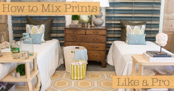
If you’re passionate about prints, you’re no stranger to decorating and redecorating based on current trends and seasons. Incorporating bold designs and patterns into your home décor can be challenging, but certainly doesn’t have to be. The key to mixing patterns like a pro will come a little easier once you’re familiar with the basic do’s and don’ts of print clashing.
1. Find Your Power Print
When jumping into mixing your favorite prints, the best thing to do is to start with one primary print that will carry the overall theme of your room. Maybe it’s a bold ikat drape or a floral window seat cushion. Whatever it may be, make sure it’s one that you’ll enjoy for longer periods of time. It’s this piece that will build the rest of the room.
2. Room Size Equals Print Size
When you begin the search for multiple prints, coordinate the size of your room with the size of the print. You don’t want a large print taking over a small room or office, just like you wouldn’t want a small print getting lost in a large living room. This also goes for the amount of prints mixed into one space. Even if five prints look perfect together, you may not want to place them all in the same room. This is especially important for those smaller rooms or offices. A bold throw pillow is the perfect addition to a small space.
3. Match Colors – Mix Prints
While power clashing is all about bold design, don’t forget that you need cohesive elements from each print to truly bring a room together. In this instance, we encourage tying the same color throughout each print in your space. This creates a natural flow between each print, while keeping on trend with multiple prints in your home.
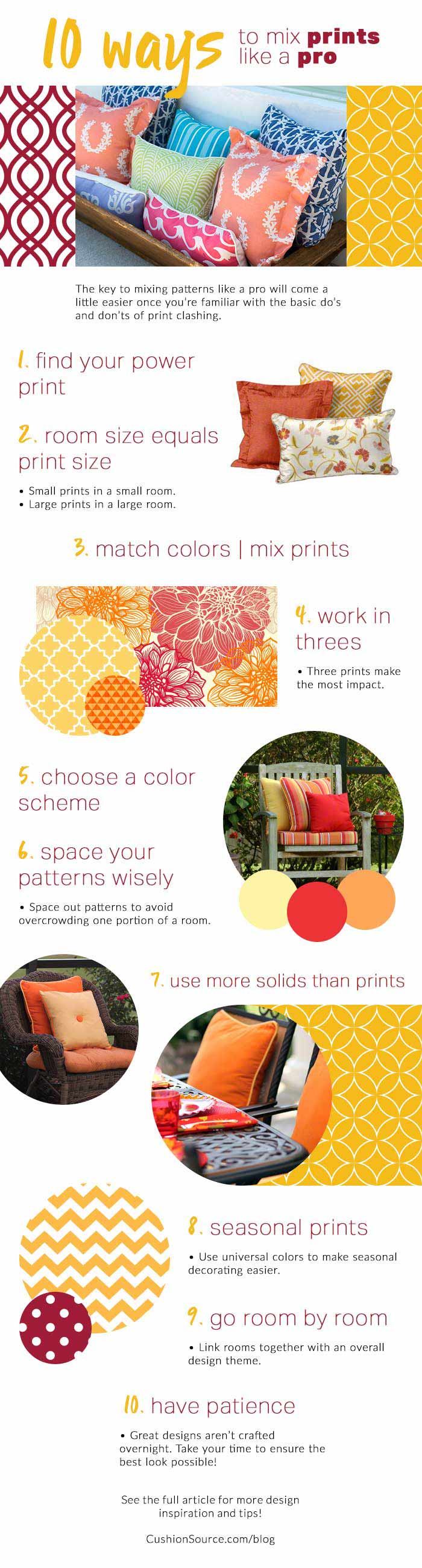
4. Work in Threes
Three seems to be the magic number when it comes to mixing prints and colors. If you stick with two prints, it’s easy to appear like you missed the mark. This is where three fabric prints come into play. Start with your statement pattern that will be the boldest addition to your room. The next print should be a different scale of your primary pattern. Use your third pattern to tie the previous two prints together for a polished look. You can do this by pulling colors from each of the first two into the third.
5. Choose a Color Scheme
As mentioned in tip number three, color plays an important role in the mixing and matching of patterns. Pick a loose theme with your color choices. Base your color scheme off of your first power print. Once you have a set color scheme in mind, pick your additional prints accordingly. Try to not mix pastel colors and rich jewel tones together in one room. Vivid jewel tones will overcome other prints, if their color isn’t as eye-catching.
6. Space Your Patterns Wisely
Now that you’ve set a theme, be sure to space your prints accordingly. If you’re decorating a large living room or bedroom, avoid stuffing all prints in one area of the room. This will over-saturate these areas and leave other spaces of the room looking bare in comparison. This is especially true for open concept homes. If your dining and living rooms exist in the same space, spread your prints throughout each room to create a cohesive environment between the two rooms. Consider using the same print from your bar stools as your drapes.
7. More Solids Than Prints
While the entire list is focused on incorporating prints and patterns into your home, we also encourage using more solids than prints in your overall design. Without these “blank spaces,” rooms are easily overcrowded. Keep the print-to-solid ratio at roughly 30-percent print, 70-percent solid. While this can change from room to room, the general ratio should be a rule of thumb to keep things clean.
8. Seasonal Prints
If you’re a decorating diva like most of our blog readers, you’re likely to decorate any chance you can. To help ease this process, it helps to think about the holidays even if you’re decorating for the long run. Use prints that can easily move from season to season and colors that work for summer, fall, and winter. Remember that some fabrics do best inside while others are meant to weather it all. If you’re decorating for all seasons outdoors, you may want to choose a color fast acrylic fabric like Sunbrella, Robert Allen or Para’ Tempotest.
9. Go Room By Room
Your entire home should have a similar feel with rooms holding their own unique look. One of the easiest ways to do this is by mixing up your prints, while keeping similar colors throughout. This doesn’t mean each room needs the same overall color scheme. It only needs to be one of the many colors you choose to incorporate.
10. Have Patience
We all want our projects to be done sooner rather than later, but don’t forget to have patience! If you find your dream curtains but can’t find the other pieces to match, don’t sweat it. You never know when you’ll stumble upon the finishing piece to complement your current patterns and prints.
Don’t forget to have fun when it comes to mixing and matching your favorite prints! While the process might overwhelm you at the start, take it step-by-step to create your perfect space. To kick start your print search, visit our fabric gallery to see exactly how easy it can be to pull together the precise look you desire.